A few months back, we had a chance to look at the ways that you can design and order your own custom vinyl stickers. Now, though I’m not a print designer by trade, a lot of you messaged me back saying that it was “Super helpful” for them.
With my history as a web designer, we don’t always consider what it would be like having to work with physical products. And because my focus this year is only taking on branding and logo design clients, I want to make sure that if you ask me, I can give some pretty good recommendations still on how to work for print.
This also will help tremendously when clients ask for a branding engagement that involves a lot of print work.
As I start to build up that knowledge, I’m going to be sharing what I’ve found and what I’ve learned as a result of working with three different printing methods, designing for physical goods.
I put myself through the process of working with:
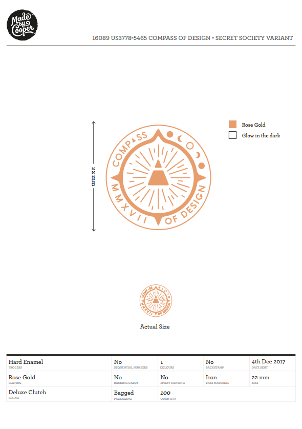
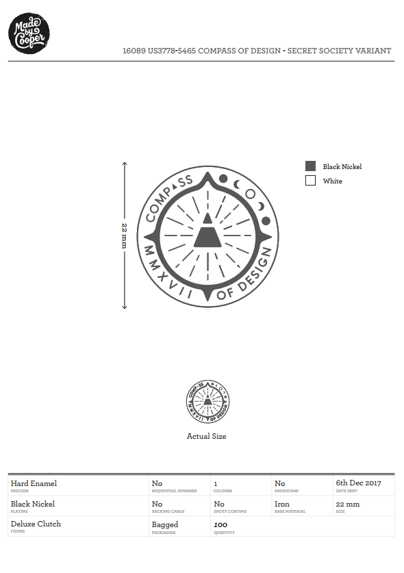
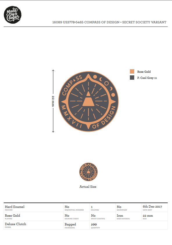
Made by Cooper** **— for 2 custom hard enamel lapel pins
Sticker Mule** **— for custom cut stickers (Die Cut and Kiss Cut)
Rise and Shine Letterpress** **— for custom designed pin backing cards
If you also think it would be super valuable, I can also share what I’m learning about how to ship these to people, like I’m doing for our community members that shared their address with me. (:
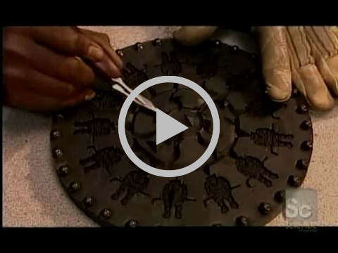
I loved watching those “how it’s made” videos from the discovery channel
This video below is a “how it’s made” about the Lapel Pin making process. This may vary from company to company, but this is all close to the same for most companies that do it. Actually, this may or may not be how it’s done today. It’s how it used to be done if not. haha.
The fun part of making lapel pins is that the process is very limited, and in order to get a design that works, and that you are satisfied, you have to know the medium really well, or be willing to make compromises.
For those who don’t watch it, there are essentially a few steps:
They make a negative die and mold
Fill it with hot metal
Plate it with the type of metal you chose
Polishing the rough edges
Coloring in the designs
Setting the Enamel
The specific type and process you choose can have an effect on how much the designs cost to produce.
While you play with most pin producers cost calculators, you notice that you get a good discount for buying more pins in bulk as opposed to smaller orders.
A lot of what you pay for is setup: The mold and the die
The materials to produce are run later in the process and essentially aren’t as expensive.
The other modifiers to cost are:
More complicated designs are usually more expensive to produce
The enameling process you choose (Hard vs Soft Enamel)
How many colors you choose to use (less colors is less expensive)
If you use any special colors (glow in the dark, glittery, etc)
any add-ons like custom printed cards and pin clasps.
I made a run of 100 lapel pins of two designs, and both were about $2.65–3.30 per pin to produce. (I only say it that way because some of you probably don’t want every option available and some do).
The companies that make them: The companies are spread out all over the place, and there’s a huge amount that are produced through China and Korea, like, a lot. So you should always try to do research with who you want to make them.
There’s a really good list of pin companies here from Designer News There is also:
Made by Cooper (Who I chose)
Curio Mill to crowd fund your pins
So how do you come up with the pin designs?
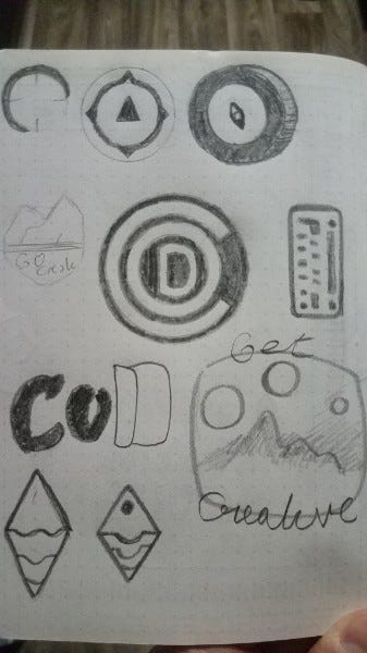
Sketch out your ideas before going to digital.
Per our last guide on tinkering, we talked about sketching your designs before jumping on the digital bandwagon.
I really love sketching out my ideas first before jumping on the computer to pound out a design with the mouse and keyboard.
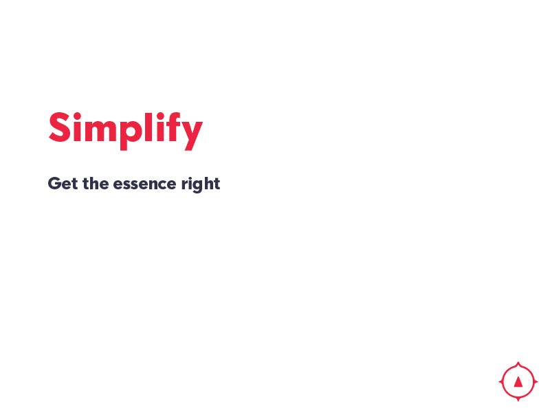
When you create your designs, you have to remember that the simpler designs will be the most true to their original sketches once printed out.
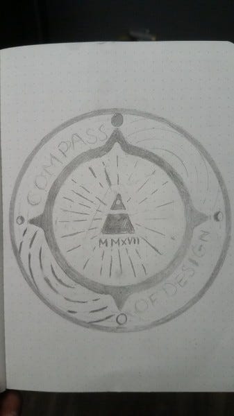
What you see at the top of the email is almost how they turned out.
My process above was just to get as many ideas of where to start, and then I had a really cool idea, which I expanded on the right.
Use the right settings
When taking your sketch to digital, there are a few things you need to understand about this process.
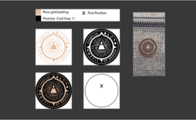
Human beings are incapable of objectively telling how big something is without something relative to compare it to. We’re comparison beings. So when designing these pins, we have to work with either Inches (like 0.65”) or in Millimeters (like 19mm).
Since we are also working with die struck materials, the thickness of your lines and the gaps between them have minimum requirements. I admit that my design above was slightly ambitious but it was worth pursuing. I did my best to size everything to their requirements.
Some of those requirements are here below.
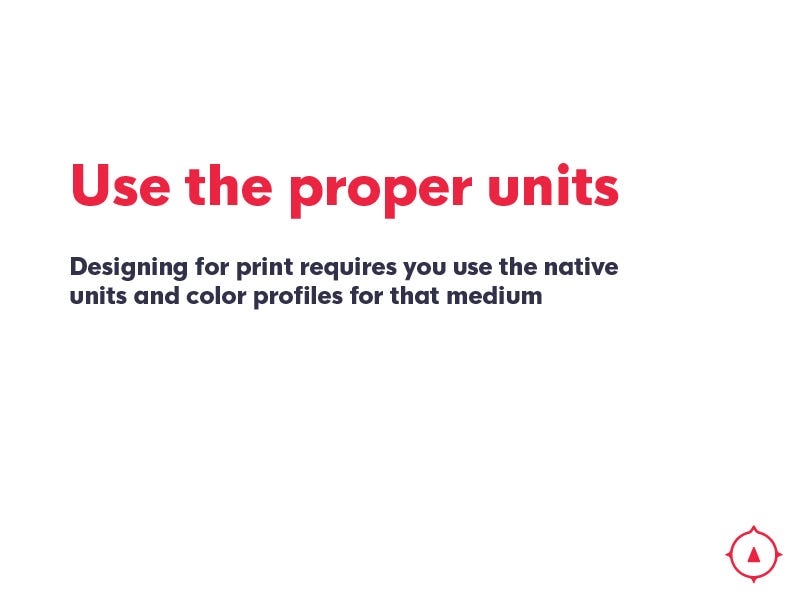
We are desgining physical objects. These objects are going to have actual dimensions, so instead of working in pixels, you will want to select the right unit (Inches or Millimeters) depending on where you’re getting these made.
If you’re curious about what the common settings are, check with the printer or search online.
You must eliminate things like Overlay/Blend Modes and gradients
These type of effects aren’t really possible to achieve consistently for mass production unless your printing company says that it’s possible. You might be able to get clever how you represent that with your pin, but expectations are that the simpler the better.
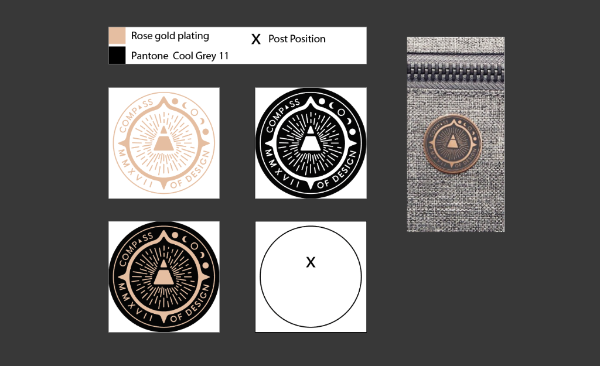
Your color profile should be in Pantone or CMYK Usually, your printer can work on this with you with your proof, but knowing right off the bat which pantone color or CMYK setting you want your color to be will help you save time and get quicker to production.
If you’re wondering what color profile you’re already in, you might be able to see at the top of your document like in Adobe Illustrator. It has the file name and then the profile of color being used.
For those who have no idea what a pantone color is you can check out this converter here (for RGB, HSL, etc) or this guide to pantone.
Be as specific as possible Sometimes it’s hard to know from an image exactly how something should be done. But if you know what you need done, like a specific part that needs a hole or gap, or where your pin needs to be placed on the back, what specific colors to use, what’s getting colored and what’s not.
The more specific you are on the process the better.
I know I had said it once, but you need to make sure your idea is simple enough to be put through their process and turn out correctly.
They did say that the lines in the center were too complicated for the process, which I expected so we compromised first, and then opted to simplify later.
If you’re using more than 4 colors usually, the price goes up. So it’s in your best interest to come up with designs that distill your idea into it’s simplest form.
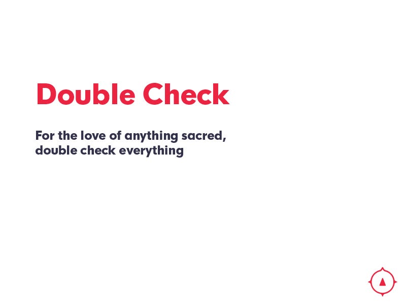
Double check everything.
Don’t send your file off or approve your design proofs without checking these things
That the right color profile was used (Pantone)
That your design has all the right pieces labeled with the features you wanted
That you have all text and complex line work outlined as shapes, not lines
That you created the document at the right size and with the right units
That you’re not doing something crazy that the lapel pin companies can’t make
That all of the elements are where they should be on the pins
That any proof you have matches what you have outlined.
And on top of checking all of that, sometimes the printing company will send their own proof before going to production. Always double check those with the original design. Make sure that you check off the list again there too.
The people that prepare everything are human, and though they are professionals in their field, they make mistakes too sometimes. It’s okay.
You will usually have some time in between to check your proof before it’s sent to production.
I had a misfortunate mark, where these three proofs below came back different than I had imagined.
I didn’t want glow in the dark for this pin, and then, I asked that was removed, I got sent a design where they removed glow in the dark, but switched the metal and color that the design would be. (kind of a cool idea, but not what I had wanted), finally, the last proof was good.
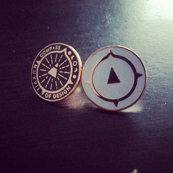
How did they turn out?
They turned out really really good. I would recommend trying this at least once if you’ve been curious and have a really cool design that everyone seems to like.
I plan to share mine with the members of the community (and future members until I run out) and doing more of these to give them in the future. (: