In the lead-up to this series, I envisioned a robust list of bold and disruptive brands/re-brands. The most obvious subject was Starbucks, an absolute cultural phenomena. Other brands followed. The latest, The 9/11 Memorial Museum, is the heaviest subject matter of all and arguably the most cohesive brand experience. So I’m walking the line along with the makers of this Museum: respectful tribute and apt accolades in the worst of experiences. I hope that comes across in it’s purest form.
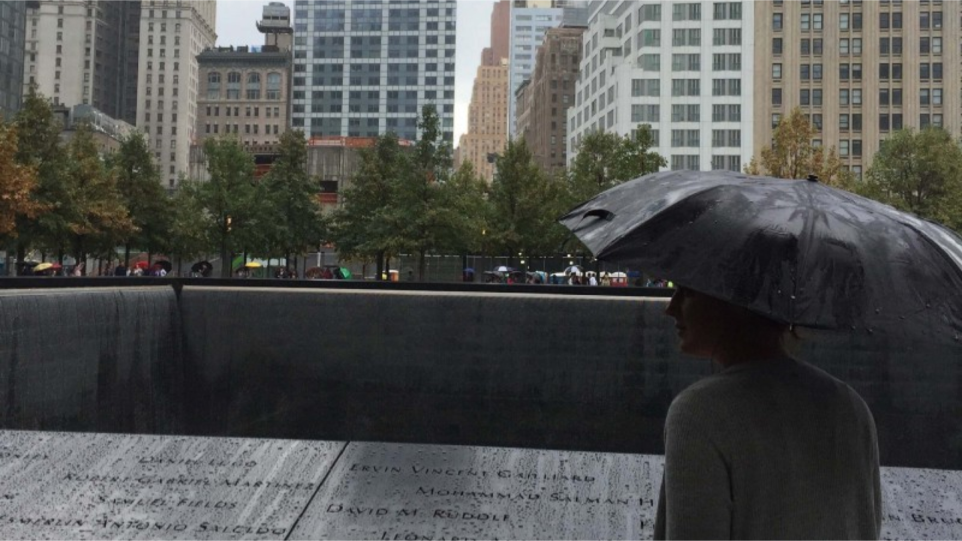
Great brands elicit emotion: sadness, resolve, loyalty, excitement. These are positioned beyond their peers to tell a poignant story. Perhaps no brand is more tied to emotion than the 9/11 Memorial. In the latest installment of Great Brands and their Makers, I take a look at the elements that make up the memorial experience.
This fall marks the seventeenth anniversary of the September 11 attacks. Remarkably, it’s been only four years since the memorial/museum opening. It took over a decade to build a creative team and aptly implement a tribute. Following 2001, creative leads collaborated in constructing a brand identity and exhibit design to rival the very best sites of historical and contemporary importance.
The memorial as a whole solicited many creatives, but a few notable ones include Director of Museum Alice Greenwald, Landor Associates, Handel Architects Partner Michael Arad, Peter Walker and Partners, Davis Brody Bond and SNØHETTA. Each of these brought about a brand that sought to
bear solemn witness to the terrorist attacks of September 11, 2001 and February 26, 1993.
](https://cdn-images-1.medium.com/max/2000/1*NEF_B6M5Vm3ddJq_-lbS-g.gif)
Brand Identity
If you’ve ever had the opportunity to visit, the first touchpoint you’ll experience is the brand identity.
Primarily, naming proved to be a difficult task in itself. 2006’s name of World Trade Center Memorial Foundation to National September 11 Memorial & Museum at the World Trade Center indeed was a mouthful. Creative Agency Landor offered the simple 9/11 Memorial Museum as a distinctive, accessible and reinforced idea.
Given the heavy subject matter, Landor was further chosen to create a visual identity system that married meaningful visuals with careful and respectful execution.
Designer Rietje Gieskes and Creative Director Craig Dobie set the mood in the timeliness typography of numerals and the bold simplicity of the letters. Most obvious is the tower-like ‘11’s.
Says Landor,
The new visual icon is built upon two pillars of strength and solidarity. The simplistic use of the date, 9/11, with the ’11’ standing alone in a subdued blue against the black ‘9’ and ‘Memorial,’ the icon allows the gravity and authenticity of the events that occurred on 9/11 to speak for themselves.
](https://cdn-images-1.medium.com/max/2000/1*EJNyRlbq3x-AqPebOYMlhg.jpeg)
A Chronological Walk
Landor was also tapped to create the exhibition design. Landor quite expertly walked the line between flashy and exploitative. Museum architects and curators also had a tall order: pay tribute and tell the truth without traumatizing visitors. The audience are twofold: those that lived through the experience in close proximity and far away. With this mindfulness, a chronological layout of the museum was aptly created. That’s the way we talk about that day, by timeline.
So as you start the tour, you’re slowly drawn into the memory of the day. Election Day in New York City: an already marked day in the nation’s history. Press clippings to gear up the vote, bringing us all together in innocence and silly partisan bickering. Then you barrel into 8:46 a.m., the moment of impact.
In a tasteful but eery fashion, spiral further down into the abyss of the narrative. All of your senses are stimulated the further you walk;
Statistics: Infographics of perished souls in the towers,
Drawings: 2,983 individual watercolors painted by people trying to remember the exact color of blue on that morning,
Impact steel: the columns initially hit in the North Tower,
Voices: 417 global unifying reactions following you as you step towards the next view,
Voices: message from and to loved ones,
Artifacts: In-flight magazines, firefighting gear, small momentos completely untouched by destruction.
Again, both exhibit and identity design well-position the brand message of
bear solemn witness to the terrorist attacks of September 11, 2001 and February 26, 1993.
@Wired appropriately calls the Memorial design “near impossible”. While a single memorial experience could never fully honor victims, these makers transformed an horrific experience into inspiring documentation.
Originally published at www.julianebone.design.