We have to make decisions for every element we design, and based on how much of the color in our design is built from having a set process, we may be making these decisions repeatedly and to no end.
Constantly we have to figure out which colors to use, choose which colors to replace, or choosing to use no color
This Guide
The purpose of these Design Principle guides is to introduce the “Why” of why we choose what we choose.
The goal of these guides is to equip you with the skills you need to build intuition and start making faster design decisions. By understanding more about the color process, you’ll be able to quickly and more objectively choose your colors in your process.
The art of choosing better colors is just one of the things that we work on together in the Compass of Design Community.
Previous installments
If you’ve missed any part of the previous guides, make sure you check them out.
Color
Color is literally the human perception of light bouncing off of or radiating from real objects.
There are billions of colors that the average human eye is capable of detecting. Though we can see every color imaginable (no seriously every single one imaginable, try to imagine a color you’ve never seen before… then you’ll appreciate the ones we have), we’re nowhere near close to being able to recreate the entire visible color spectrum artificially. This limitation is what creates the gamut of color that is available for us to use.
The Color Gamut
PC Mag states that gamut is…
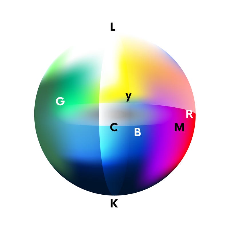
The entire range of colors available on a particular device such as a monitor or printer. A monitor, which displays RGB signals, typically has a higher color gamut than a printer, which uses CMYK inks. When a color is “out of gamut,” it cannot be adequately converted to the target device; for example, to a different type of printer
There are things that hold us back or that we have to work around when it comes to creating a consistent design, both on screen and off screen. These limitations are how we start to define great work.
The limitations
Each process of color mixing has its limitations.
Whether we build the colors from light (shining different colored light spectrums) or from pigments (absorbing specific color ranges from light and bouncing back the one we want to portray)
Additive
Additive color is built from light. If something is not lit up, it appears to be black. As we start to introduce new radiating colors from a light source, we increase or add different colors to get from black (no light or color) to white (light built from all color spectrums)
Subtractive colors
Subtractive colors are built by adding pigments that subtract colors from the available light. This just means that each pigment absorbs a different colors removing them so that they display only a certain wavelength.
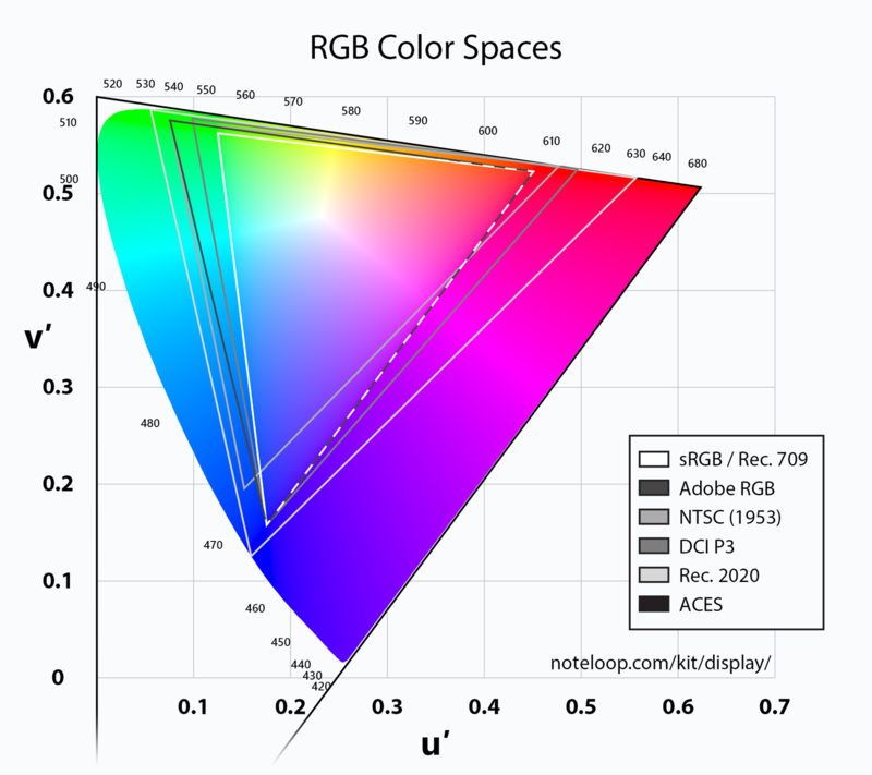
Matching systems
Because of how different these two color processes are, we have to have specific methods to match the colors we see on screen to what’s available for printing. If you reference the chart above, you can see that not all processes can display the same amount of color.
To do this, you can look at my guide for Print Design and my experience with my letterpress printer, Rise and Shine Paper.
There are very few methods of attaining accurate colors in print design. Ink is inherently translucent where digital colors with visual displays are capable of much more than printers can achieve. Therefore we have specific color methods to print with.
A little bit about color matching:
As digital designers, we often create our designs in the RGB color space since most of our work with UI designs are going to be used primarily in digital interfaces. But when we look to expand a brand that we’ve worked on beyond what we see on screen (e.g. taking it to print), we create a considerable challenge for us to recreate what we made in RGB as a CMYK or Pantone color. Which is something you shouldn’t eyeball at all.
In a recent discussion of this with some designers, Katie Male (a graphic designer and brand stylist), talks about how she works to combat this color discrepancy.
“Going from CMYK to RGB is easier only because it can be visually matched but I always test on different devices ie, iPhones, Androids, monitors. However going from RGB to CMYK is not advised due to the certain brightness of papers and what your printers profiles are set to. Never eyeball. I always recommend clients to have a Pantone if not I use a close commercial match Pantone. Use a Pantone Bridge book for accuracy. If it’s a digital print then ask your printer to create a wet proof before the artwork goes into production.
— Katie Male (here’s a link to her work)
If you don’t know what is possible or what isn’t, it’s your job to figure that out and understand it. Maybe consult with the place that is going to print your work to find out what you can do.
From Ryan, my letterpress printer.
“We mix the ink from the base Pantone colors, which are mixed by weight. We use a lab scale to weight the can and remove the exact amount of ink needed for each color. It is carefully blended by hand using an ink knife on a slab of granite. Care must be taken to ensure the base colors are thoroughly blended. ” — Ryan
The color of the ink can be chosen by using Spot Colors, CMYK or more often using the Pantone system (a form of spot color). With the colors you want, it’s essential to choose colors that are approved for printing. Using RGB colors doesn’t always translate well when it comes to ink. So make sure that whatever colors you select for your brand or other design projects play nice when applying it to where the design is used.
“We make a drawdown on the paper to test the color. This lets us see through the ink film to make sure the color is a match. Our scale is fairly accurate so the colors are usually pretty good. Sometimes we have to adjust a bit for differently-colored papers or to accommodate thicker or thinner ink films for certain artwork. ” — Ryan
The way that the ink works is that to get more vibrant colors, more ink needs to be applied. This method means that the color is an additive color and thus it can be more challenging to print lighter colors on darker paper, where foil may be the safest option to get a brilliant print on dark or colored paper.
Calibration To ensure that you are getting the best match in the first place, it may be important to calibrate your monitors correctly. For apple specific devices, you can check a guide on how to do this with Apple devices
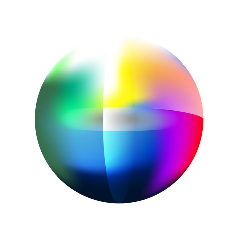
Color Variation
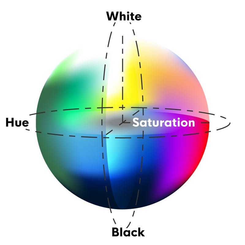
Hue
Hues are the specific location you are at in the purest form of the color spectrum. Red, Yellow, Green, Blue, and Violet are all just names of the locations on that spectrum.
Usually, hue is represented as a specific degree in the 360° range.
Shade
A shade of a color is how dark the color is that you are looking at. This is achieved by adding black or dimming the lights that make the color.
Tint
A tint of the color is how much white is added to the color (print) or how bright the light is that makes it.
Saturation
Saturation is how much of the hue is added to a specific shade or tint, or how much of each light is added to the original color.
Color Spaces
RGB
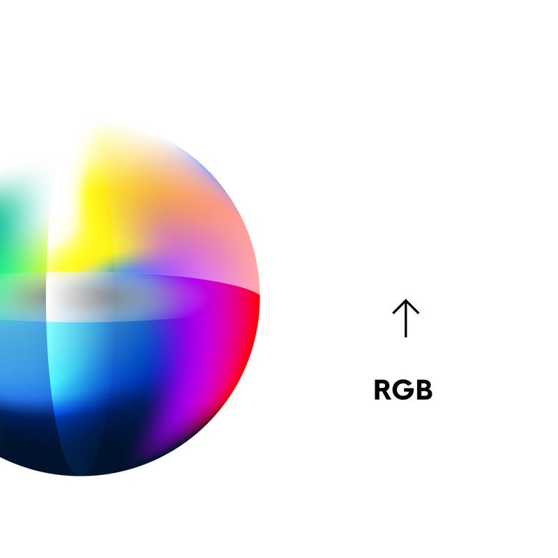
The RGB color spectrum is an additive color process made by lighting the individual pixels on the screen with variations of these three color intensities:
RED #FF0000 GREEN #00FF00 BLUE #0000FF
This spectrum is often incompatible with printing, just because there are colors that are beautiful on screen, but come out flat and dissonant in print design.
Make sure that you understand which mediums you will be presenting the finished work because if you get this wrong, you might have clients or employers angry that the colors don’t match on and off screen.
CMYK
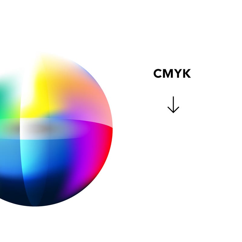
The CMYK color process is a subtractive color process made by increasing the amount of ink used in one of the four base colors:
CYAN MAGENTA YELLOW KEY (black. If you want to see why black is represented as “key” check this article out.)
Often the color process in professional printing is done with halftone printing. Magazines and Newspapers were a massive driving force for this since each color would have to be printed one by one over each other. The plates that were used would have to be lined up and pressed or printed onto the paper. To achieve different colors, often you would have to use half-tone prints (section 2 in the linked document) or layering
The entire process for Riso printing is really cool to watch (4 part series) too because you can use CMYK printing to achieve some really cool effects.
Choosing Pairings

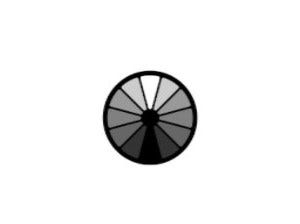
Complimentary
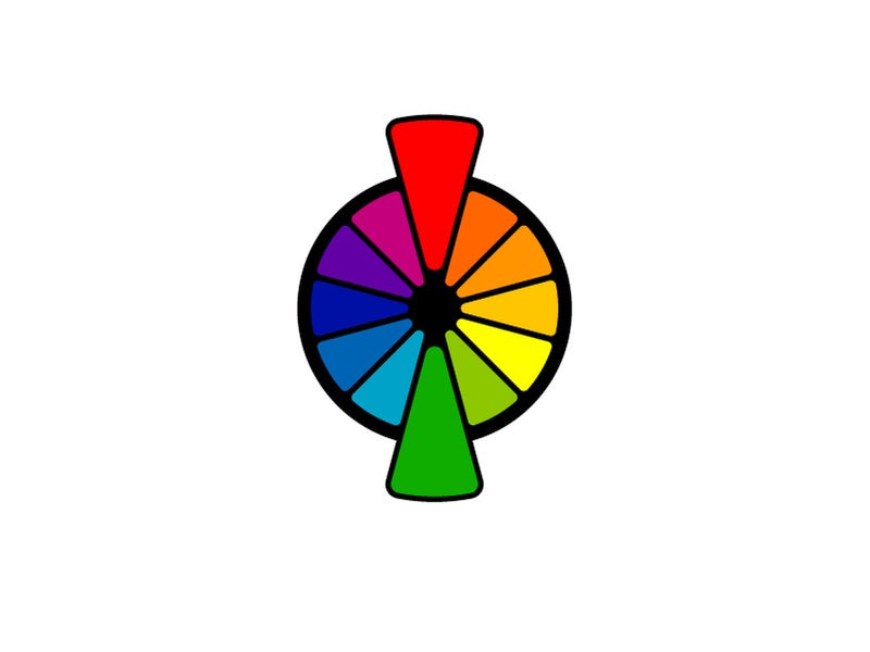
Complimentary colors sit opposite of the color wheel. This can be really harsh when used directly together in a composition. It can be difficult to detect with color blindness as well. But when used sparingly, you can create some obvious and effective calls to action or differentiate options.
Open Triad
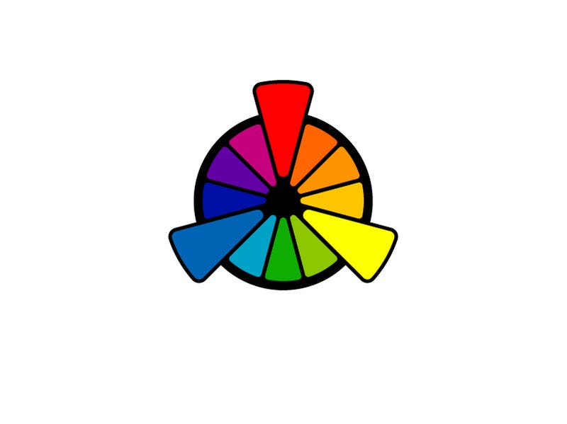
We can start our triad with the Primary colors. These are 3 colors that are evenly spaced around the color wheel. Traidic colors are usually very loud when used equally. So to balance out this choice, you can let one of the colors be the key color and use the other two to compliment them.
Square or Diamond

Four evenly spaced color choices create two sets of complimentary colors. They allow you to balance your choices of colors that seem cold (blue / green hues) with those that seem warm (red/yellow hues). When you let one of the colors be more prominent, you have a more effective base to start your color pallets.
Full Triadic or Hexagonal

This is a fairly uncommon choice for color usage, but brands that choose to be playful or child-friendly tend to use colors like this in full saturation.
Split Complimentary
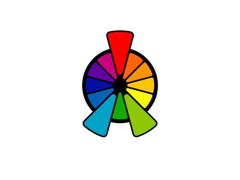
This has the same effect of complementary colors but you have less jarring visual tension. This allows you to have more mild tones and still let a more prominent contrast between colors.
Analogous
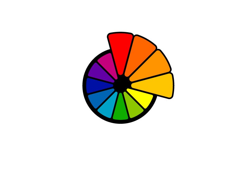
These colors sit adjacent to each other on the color wheel. They allow you to pick colors that move well together. They have less visual contrast so make sure you have a key to start and use the others as complementary colors.
How to use color in the real world.
Building effective color palettes are something that takes a lot of trial and error.
Hopefully understanding these concepts with color will help equip you with knowledge about color. But how do you use it?
There are plenty of sites and books that showcase good color palettes.
I am by no means a master of color selection, but as part of my work with brand identity design, selecting effective color palettes is something that I have to do all of the time.
If you struggle with finding good color palettes, I have a few resources for you:
A friend of mine, Kyle Adams, has created a course specifically for choosing great colors. Within it, he describes the process from start to finish for producing some of the best color choices I’ve seen.
His course covers everything from selecting colors to creating tints and variations.
With a solid foundation in color choices, you’ll:
Start to form your own unique style.
Build confidence in your decisions.
Attract clients and employers who see your value
Along with using a course specifically for choosing colors, there are plenty of sites that you can look through that showcase great uses of colors and color palettes.
CSS Nectar allows you to browse by color (just use their menu)
Various Pinterest boards (just search color inspiration), pull these into your projects and use the eyedropper tools to match
These two videos about the use of color in film:


Our goal with Compass of Design is to start to make what you know more accessible to your actions. In short, we want you to not only have the answer to be able to quickly use what you know, but we want you to understand why it’s the answer.
Remember to think about what you know and why you know it. Being able to think effectively helps train your design skills when it’s time to use them.
Have a great week, don’t forget to check out our Compass of Design community!
Registration is open!
Come join us in the Compass of Design community and start getting more actionable feedback on your design work and career questions.!
Thanks,
— Darian Rosebrook, Compass of Design
:)

How do you know what skills you should focus on to get better at design?
If this is a question you need an answer to, come join other like-minded designers who are also working at becoming masters of their craft.
Every week we go over ways to market yourself better by improving your design skills, your personal brand, and other topics to further develop as a great designer.
Tap either picture to get started investing in your design skills (: