It has been a while since we last talked about design principles. That was never the intention to get away from teaching it.
If you missed the last three design principles, here they are again.
This guide:
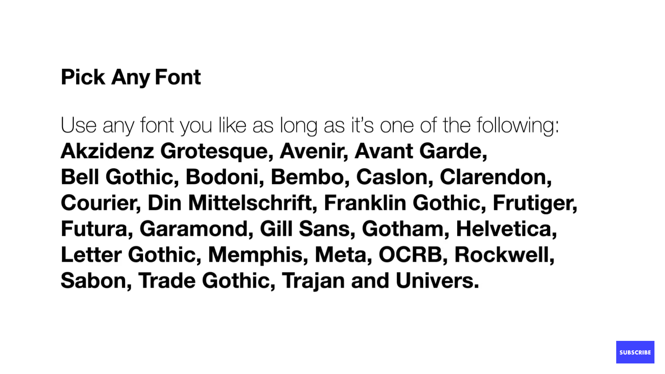
What I will be covering in this guide is not about specific typefaces, which typefaces are better when paired, or choosing what font files to use.
We are talking about being able to effectively choose what typeface you want to use solely by the characteristics of it.
It’s best to study some of the famous typefaces and understand what makes them great.
If you need help knowing some good typefaces to go study, check outthis typography video from the futur
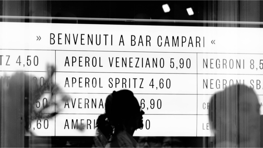
If you ever had to look at your list of fonts, I’m sure you’ve experienced that empty feeling, not knowing which to pick from your extensive inventory of all 1000 fonts you downloaded from creative market’s free weekly resources.
There’s something called “decision fatigue” that immobilizes you from making decisions if you are presented with too many options. In UX Design, this inability to make a decision because there are too many is called Hicks Law.
Let’s learn what characterizes these typefaces and what sets them apart so that you can make more informed decisions of which to use and when.
The key to good typography and type pairings is contrast.
But for us to have good contrast, we need to learn what contrast is in type design.
Type Classification
Typography has existed since the birth of written language. Even what we naively think of when imagining “modern typography” is so old that you wouldn’t guess that the invention of printed type was almost 600 years ago.
The evolution of typographic technology from the handwritten language to modern digital typefaces has undergone some massive changes throughout these last few centuries.
There are specific periods in time that classify certain typography, and many of these typefaces are named after people in those time periods. Even typefaces from today get the same treatment, so if you’re wondering why some are named funny, look to the creators or who’s handwriting they’re modeled after.
Technological advances in how we use typography during these time periods have also helped shape how we use and classify type.
Here are several of the different classifications of type, you can check out more here from fonts.com.
Humanist Serifs
Humanist typefaces are reminiscent of traditional calligraphy and Roman lettering. Made popular in the 15th and 16th centuries (1400–1599), this classic style of letters that are used today are modeled after the movements of the hands when written.
They have a lighter upward stroke and stronger downward stroke, serifs and terminals that feel natural to the hand, and their lines read close to what classical handwriting styles looked like.
Transitional Serifs
Mainly made popular by John Baskerville, these letterforms are sharper in contrast than their humanist counterparts. Through the advances in printing tech, we were able to create thinner lines and bolder bolds which allowed for us to have this style.
These have been used to replace the Humanist Serifs, but in person, most of where we find them are printed in books and old publications. Serif fonts have been falling out of style, but shouldn’t be forgotten.
Modern Serifs
Modern and Neo-Classical typography introduces an even bigger contrast in thin and thick strokes of the letterforms. This was originally thought to be an update to transitional but became it’s own classification as the lines of the forms became straighter and more contrasting.l
People were outraged at these few newer styles. Which is mind boggling to think that large amounts of people could ever get outraged over somebody’s design of something… 👀
Egyptian and Slab Serif
Through traditional print advertising, we introduced heavy weighted serif typefaces that feel a lot like sans-serif letterforms with the addition of a thick and heavy serif.
They can sometimes be a mono-weighted serif, where every thick line feels uniform, or they can really play off of the weight of the serifs.
Either way, these have been mainly used as header-typefaces. They’re really good for grabbing attention.
Humanist Sans-Serif
Humanist sans-serif type was widely used in the early 20th century (the 1900s) which kept a lot of the characteristics of humanist serif where the widths of the strokes are close to their seriffed counterparts
Sans-Serif fonts were another thing that people got outraged about. For some odd reason.
Serifs were believed to create drag and muddle up the spaces inbetween letters. We created typefaces without the serifs to help legibility, but fundamentally changed how we look at these simple letters.
Transitional Sans-Serif
Transitional sans-serif typography is one of the most widely used forms out there. If you haven’t heard of Helvetica, then you’re probably one of the few that hasn’t. They are very upright and straight-forward as forms go.
You’ll find that most of the weight and thickness of the letterforms are very uniform. There’s some daft wizardry going on with almost all typefaces, but these transitional sans-serif ones were good at remaining ambiguous and anonymous through time.
Geometric Sans-Serif
Geometric letterforms are also from the early 1900s where most of the letters are built from geometric shapes. They give very sharp and uniform letters which allow for much contrast when paired with other type classes.
Hand Script
This is exactly as expected.
This is hand drawn letterforms for use in digital and printed typography. They’re mainly based off of what we would see in today’s lettering pieces. They give an element of human touch where one would normally be using machines to produce the typography.
The edges of text
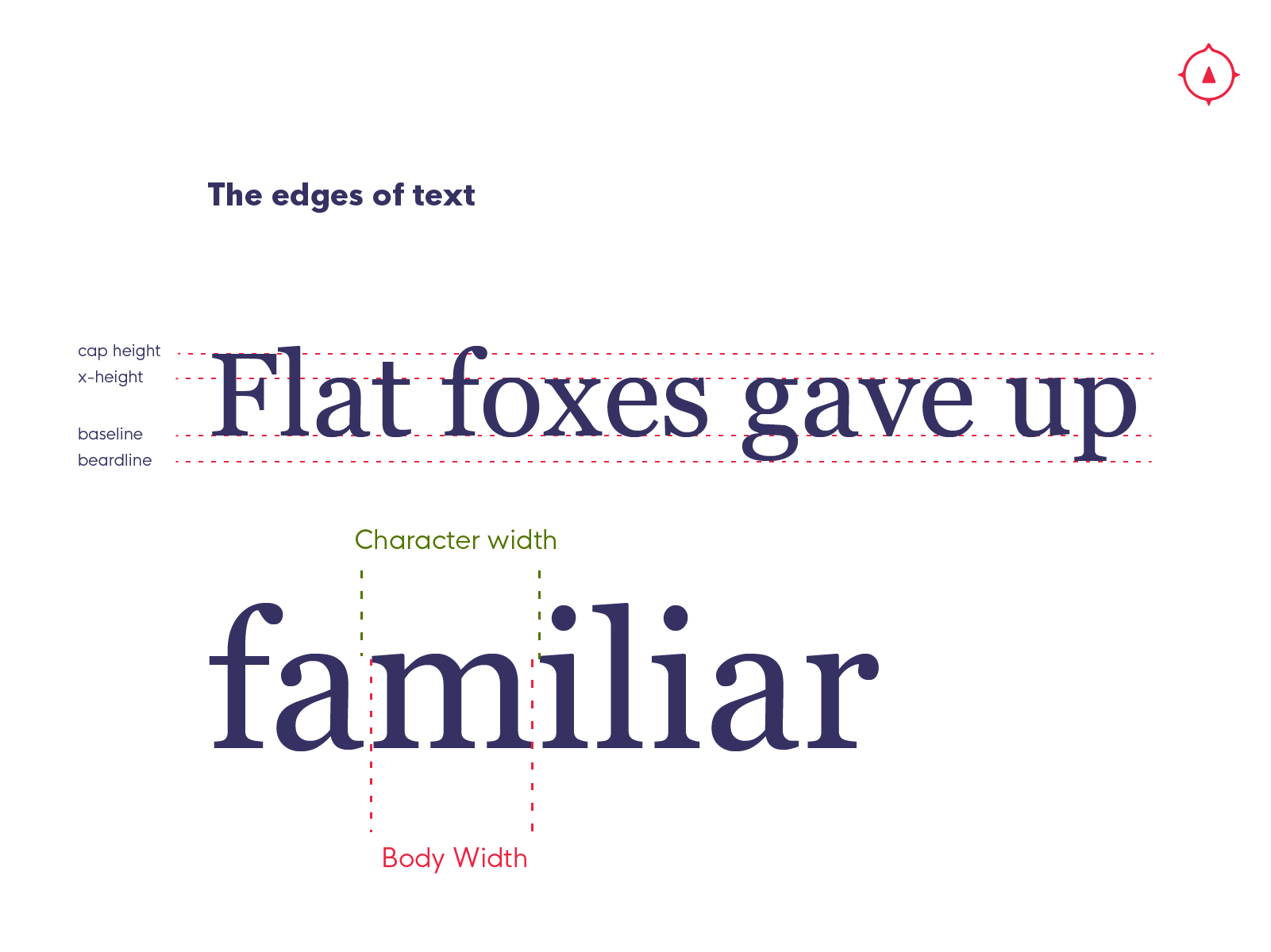
The lines that matter when choosing what typeface to use depends on what we plan to use them for.
Though this is a simplification, what we look for when choosing the type to use for our projects is how legible the letterforms will be.
In the text, we are looking for four lines:
How high is the x-height?
The legibility of typefaces is determined by their X height. This is the height of a lowercase ‘x’ in the text. The higher that line is in relation to the baseline, the bigger the text feels.
If you have a low x-height, it can exaggerate the tall letterforms of the ascenders (check our type anatomy chart below), but make it harder to read the body of text.
How tall is the cap height?
A tall cap height can even out a high x-height. But this line determines how wide the characters feel. A condensed typeface can have a tall cap height and narrow character width, making it very attention-grabbing.
What is the width of the characters?
This helps determine how comfortable it is to read across lines of text. Narrower letters mean a more cramped feeling.
Where is the beardline/descender-height?
This will help you determine how much space is generally between the letters for the point size. (see anatomy chart below)
Type Anatomy
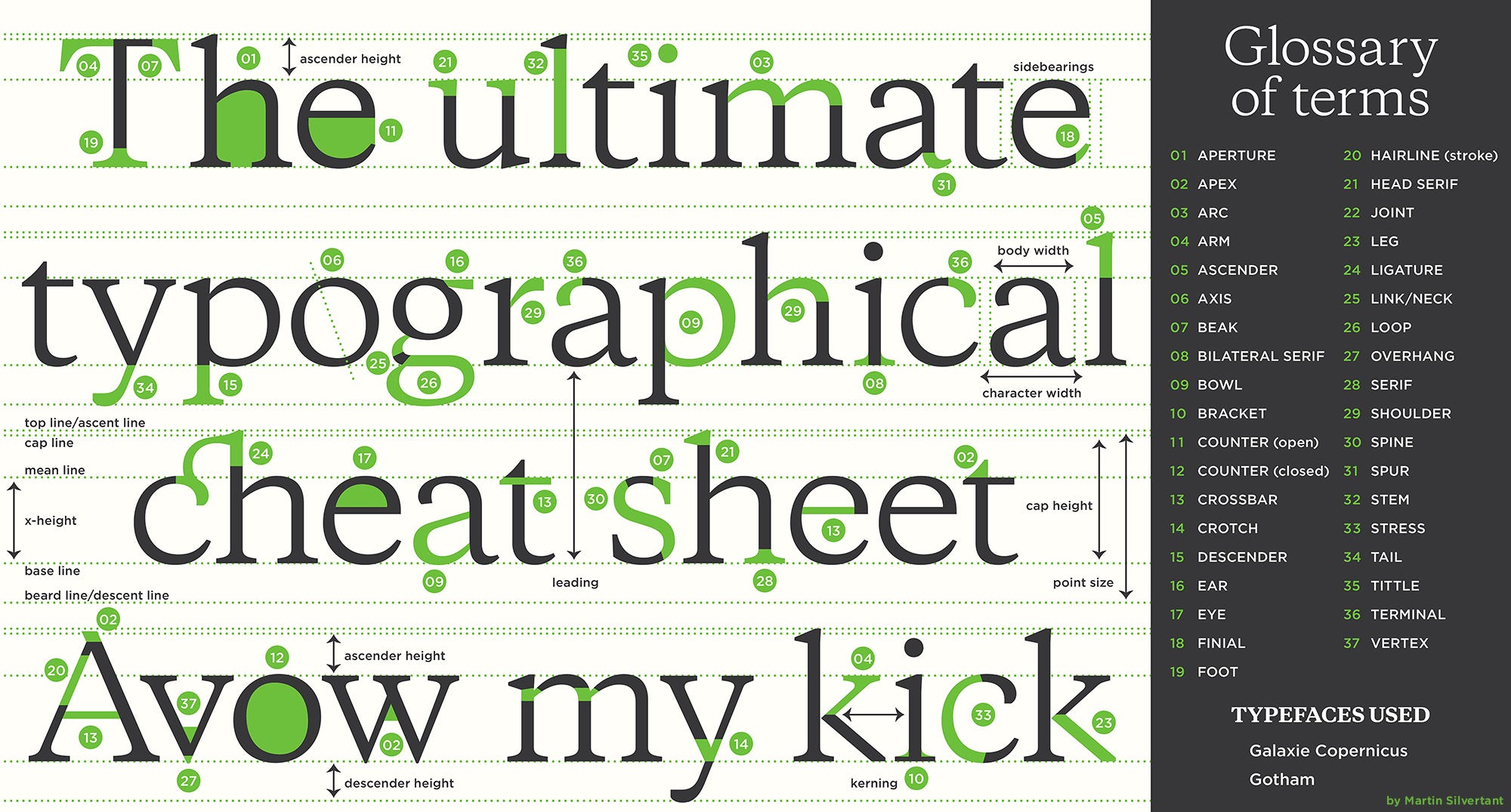
This diagram is done by Martin Silvertant whom I chose to use rather than making my own diagram here. He explains a lot of what these letterforms are made of, and what each part of the letters are.
When you’re going through and looking at which type to use, you need to know what you’re looking at. This is especially true if you have to find an alternative to a typeface and need to compare that one to the other.
This also helps you understand what sets some type apart from others allowing you to pick better-contrasting typefaces and type classifications.
Study this chart (or click the designer’s name for a bigger version of these charts) to understand what you are looking for in the designs.
Ligatures
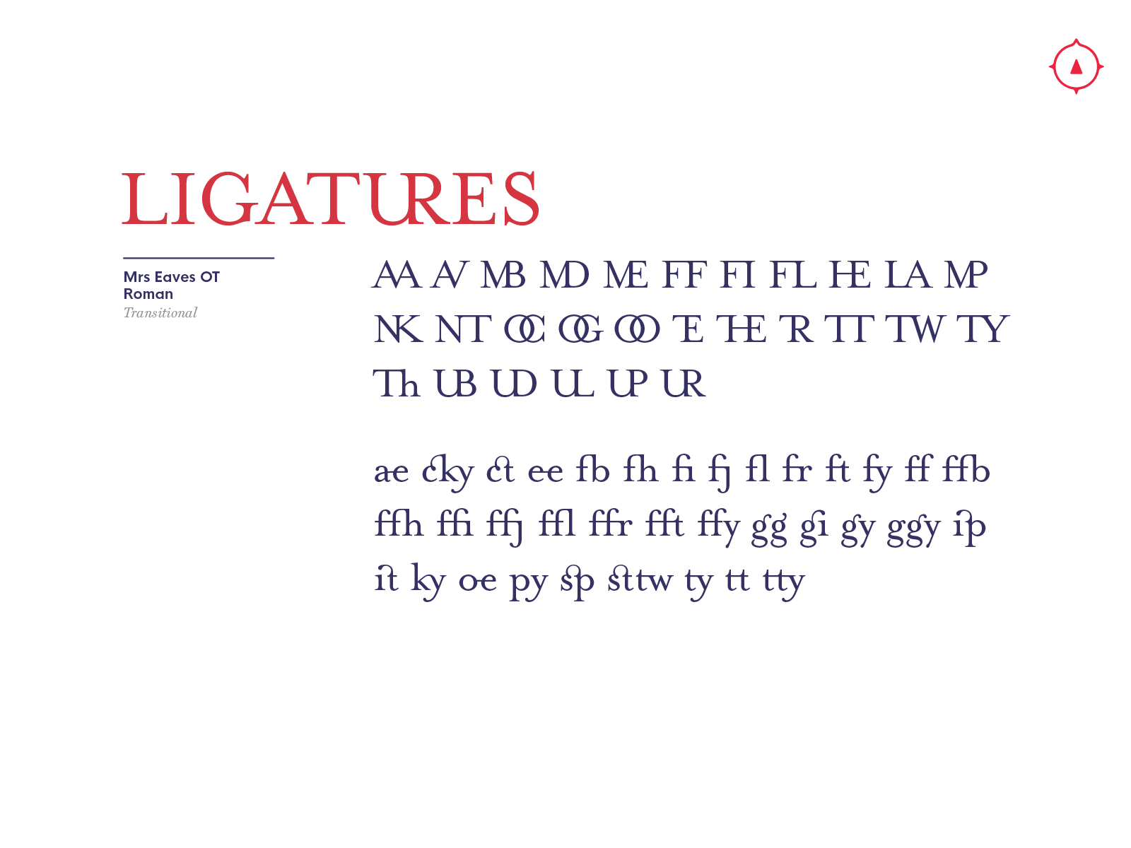
One of my favorite parts of typography is ligatures. Though I’m not studied in making my own typefaces or ligatures, ligatures to me are a beautiful mix of form and function. These above are from the typeface Mrs. Eaves.
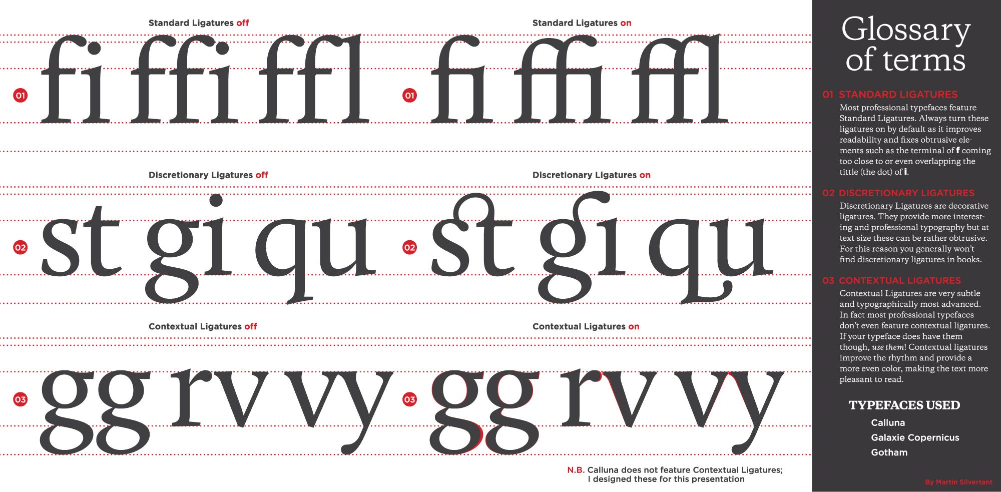
Letters, when they get close together have conflicting properties. Think of the crossbars of the letter t next to a letter f, or two terminals at the top of the ff. This chart below, from Martin again, is very helpful for understanding what and why some of these ligatures are used.
Ligatures have been used to help type remain legible when difficult letters are placed next to each other. Without these ligatures, you might have really weird, conflicting spaces or lack of space between letters.
Some countries rely on ligatures to remain legible, while others, they are merely for decoration.
The general rule is that you should let the typefaces decide what ligatures to use when typing out any of those letter combinations. (These are the standard ligatures.)
The discretionary and contextual ligatures are there for better flare within your text, but remember that design is something that helps us be better communicators. If something doesn’t look quite right with the use of the ligature, maybe keep the text without it.
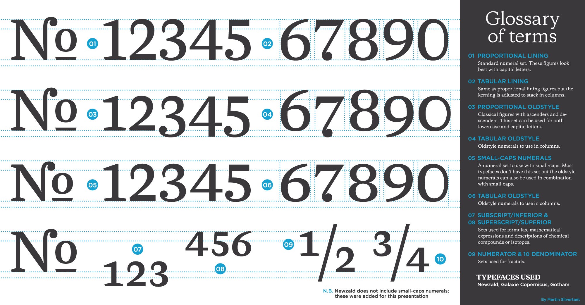
Numerals
Numerals are hard to understand because they pair specifically with the size and usage of type styles.
The type is built from the usage of capital usage. They can be built to pair well with Capitals, with full cap-heights. They can be monospaced to fit better within columns. Then you have numbers that are built with proper ascenders and descenders that fit within sentences better. Then we also have numerals to match text set in small-caps. Each of these are things to think about when choosing a typeface because sometimes, you don’t get a choice when you choose one.
Definitely look at samples of letters and numbers mixed to determine if you are going to use the numbers within the typeface or choose a different one.
Type Families and Super Families
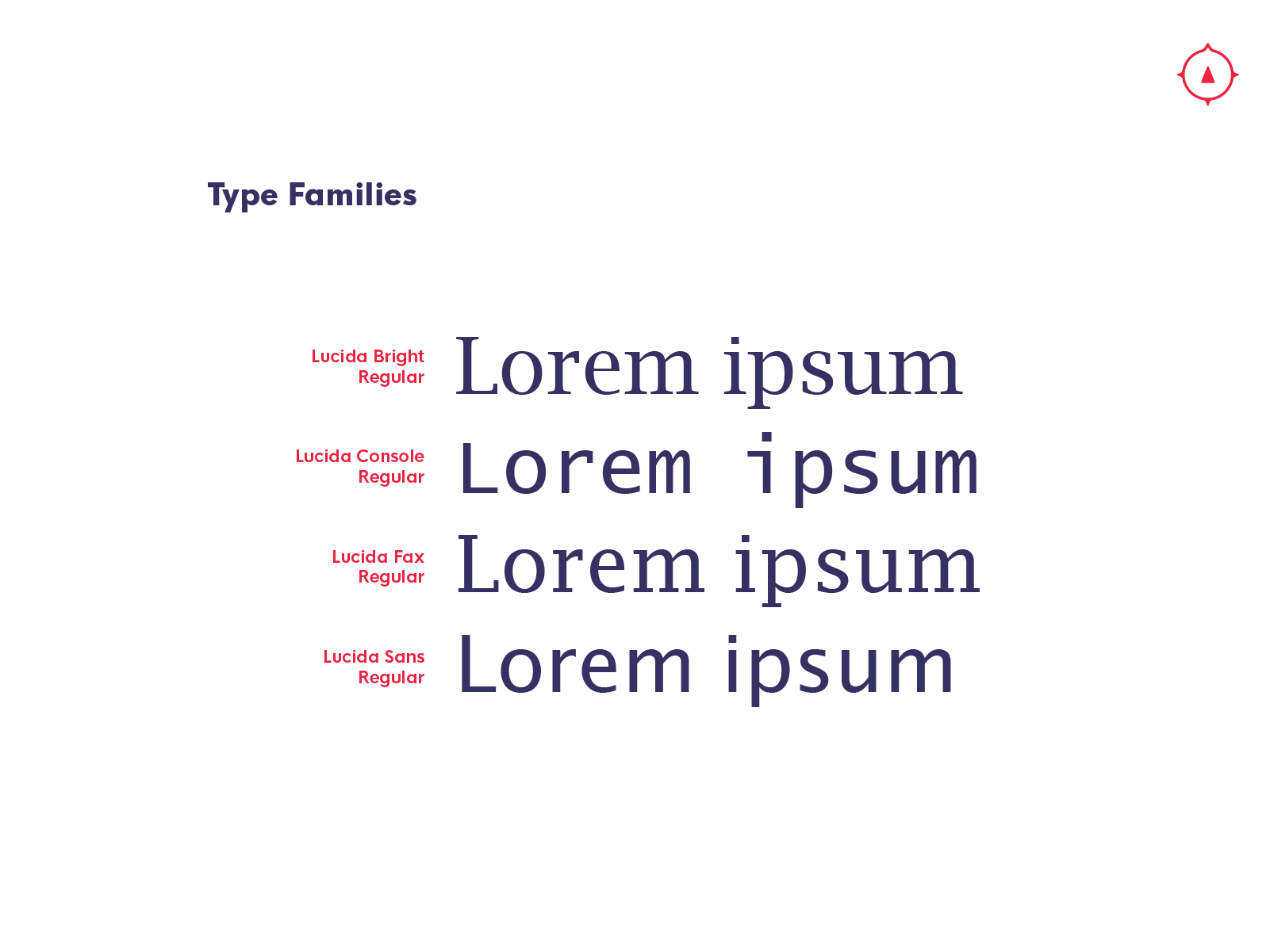
Some typefaces are built as families where you’ll get more than one weight, more than one style, or with some typefaces, every style imaginable but classified within the same family.
When you’re looking for a good type pairing, a lot of times, the typefaces have other weights or siblings (typefaces within the same family but in different classes) that allow you to avoid trying to pair unrelated typefaces together.
So when looking at a particular one to use, look to see what options are available within the same family. This may save you a lot of unnecessarily wasted time.
Type Crimes
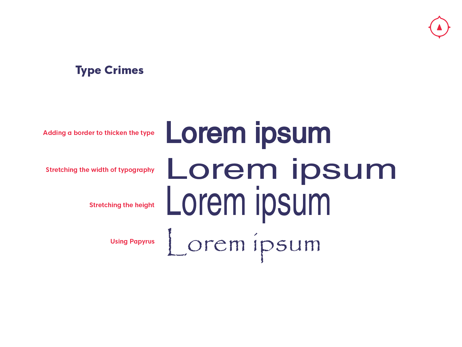
I see a lot of people who don’t know how to use a font on their system and play around with the characteristics that are built into the digital files.
People tend to try to manipulate the type to do things that it was never intended to do, and by manipulating them, you actually change the proportions that are designed in the actual widths of the strokes.
To see how to properly edit type, which takes a lot of practice, you can find a preview to The Futur’s typography class preview which explains editing type.
Mixing Typefaces
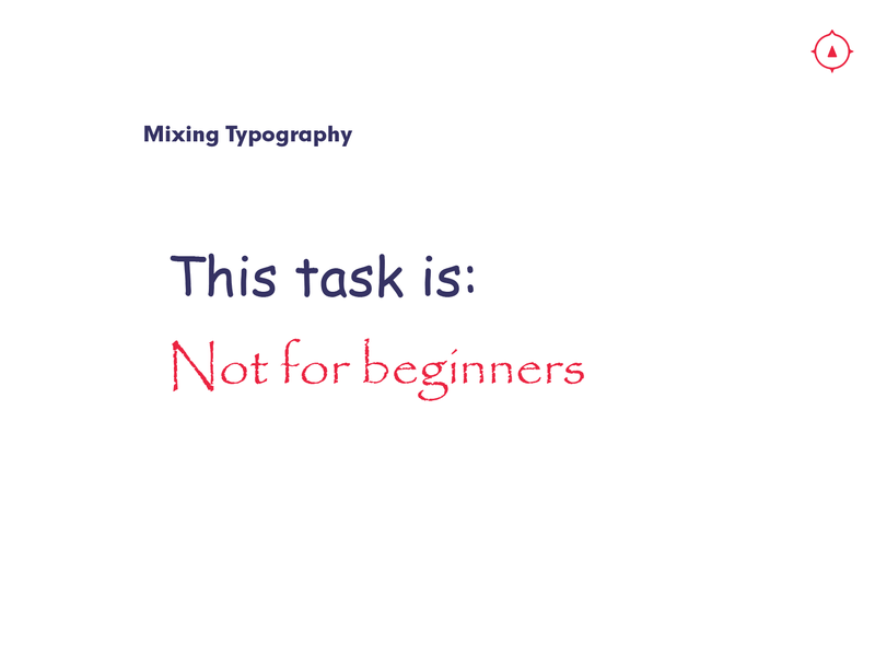
So from here, I leave it to people with more experience in type to show you examples of good type.
What I intend to show you through these are how people found contrast like what we went through today.
Look at these through that lens and find what makes the pairing great.
Do they have a particular x-height or cap height that makes the combination great?
If you don’t agree, what characteristics do you think could be improved?
Look at these combinations, and hopefully, these pairings inspire you enough to start thinking about pairing your own.
A lot of them are available through Google Fonts which is an open source library that many of them are free to use commercially. (definitely worth it to go get a few of these font-files for your own use)
This is a collection of great type pairings using Google’s font library where each typeface combo is paired with a piece of classical art.
The team at Made By Side Car put together a small series of type, where they paired some of the better google fonts together.
And here’s another Google Font combo of someone’s 100-day type challenge.
Take these as a springboard to use as inspiration. Feel free to use their pairings or use what you learn from here and there to pair your type.
If you’re looking for more resources on learning about typography
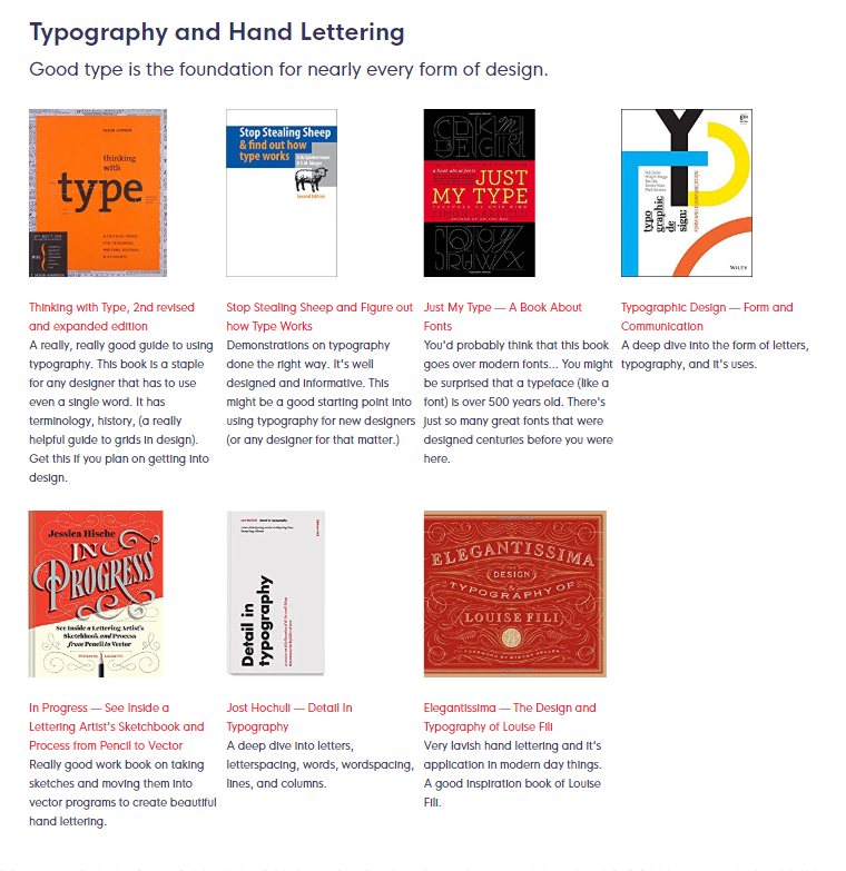
You can take a look at our library of typography books. These are the books that have helped many of us in the Compass Community get to our level of skills with type.

Also, check out the book Thinking with type which is a big inspiration to what I taught today. It goes into everything you need and probably has the best section ever about learning how to use grids in typography.
So hopefully this has been helpful to you to get better at looking at type objectively when trying to pair two different typefaces together.
If you have any questions send a reply and I’ll help you out., and until then…
Have a great weekend!
— Darian Rosebrook, Compass of Design

Take another step towards learning more about design from other designers.
Come join other like-minded designers who are working at becoming masters of their craft.
Every week we go over ways to market yourself better by improving your design skills, your personal brand, and other topics to further develop as a great designer.
Our community registration opens up once a quarter, so get on the newsletter to stay updated!